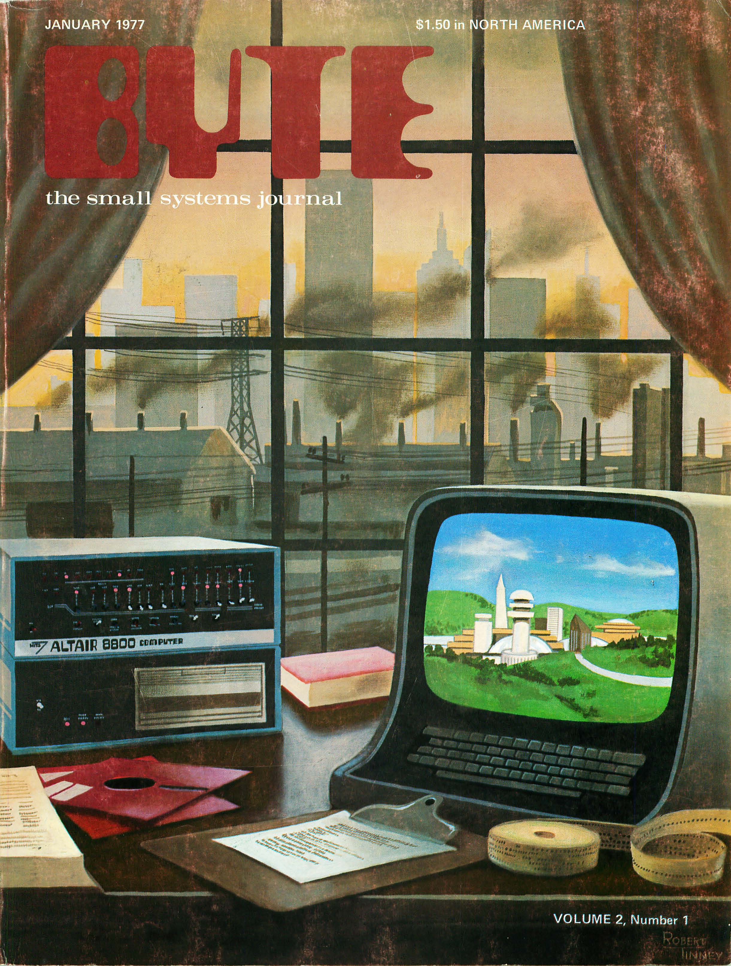
What today’s tech journalism must learn again from the legendary computer publication.
This is a very much unfinished bit I began writing in November 2020 and just found in my Dropbox Paper archive.
Long-dead BYTE Magazine gained some exposure this time last year when some of its gorgeous retro-futurist cover art - of Robert Tinney’s hand - circulated about Tumblr and Pinterest. It is fucking beautiful, yes, but I was then quite disappointed to find little in the way of the publication’s actual content available on the web.
Last week, I was elated to find this exceptional archive on archive.org with its exceptionally-scanned, ultra-high res PDFs of every issue, created by the archivist Jason Scott. The notables of its legacy are fairly well-documented - and it’s still occasionally cited by the likes of Wired and TIME, but its story and mission have been ashamedly disregarded as infeasible relics; the naivete of the originator.
In Vol. 1, Issue 1 for September 1975, Carl Helmers’ first editorial - “What is BYTE?” - is a charming introduction, full of techno-idealism and the quaint jargon of the then-obscure computing niche. The Home Brew Computing Triology is an ingenius summation of the technological conversation: HARDWARE, SOFTWARE, and APPLICATIONS - the “interrelated themes.” Helmers notes that the publication was founded to bridge the divide between the respective hardware and software cultures and get them talking about applications. Later in the issue, publisher Wayne Green explains how his encounters with the community amidst a journey to modernize 73 - his amateur radio magazine - led to this prompt.
“I discovered an interesting thing - few of the hardware chaps could talk software - and vice versa.”
A sensical and exciting pitch, to be sure, but disappointing when one considers the remaining vastness of this gulf over 40 years later. The successors to BYTE - when compared to any of its trade magazine contemporaries - aren’t technology news at all. Mastheads like The Verge, Engadget, and CNET have become something else, entirely in the pursuit of the end user click, and a good lot of them simply look like shit. Reading up on tech hasn’t been a respectful or aesthetically-pleasant endeavor for as long as I’ve been literate, and BYTE’s experience would suggest that it’s been without much worthy cause, whatsoever.
Typographically, its pages are a bit dense, but it’s in an otherworldy mysticism regarding the pioneers of digital that one longs to reanimate, somehow.
